The number that defines a dignified standard of living has shifted significantly since 2014 — and not by a little. This guide traces exactly what moved, why it moved, and what it means for anyone trying to understand whether their income is keeping pace.
What This Guide Covers
Eight sections covering a decade of living wage shifts, cost drivers, city comparisons, and practical takeaways.
Why Tracking the Living Wage Over Time Actually Matters
Most conversations about wages focus on a snapshot: what does a living wage look like right now in your county? That question is worth answering — and the MIT Living Wage Calculator makes it quick to do — but it only tells half the story. The other half is the trajectory: how fast has this number been moving, what is behind the movement, and is there any reason to think the pace will slow?
Understanding the trend matters for three distinct groups of people. For workers and job seekers, a historical view reveals whether their wages are keeping up with the actual cost of living or quietly falling behind despite nominal raises. For employers setting compensation strategy, it shows how much ground the labor market has already covered and how much more may still be ahead. And for anyone reading about housing affordability, poverty policy, or wage debates in the news, the trend is the context that makes current headlines make sense.
The period from roughly 2014 to 2025 is particularly instructive. It spans a relatively stable pre-pandemic economy, a brief disruption, a once-in-a-generation housing surge, and an inflationary episode that touched every component of the household budget. Looking across that range gives a picture that is far more complete than any single year’s data.
A note on the data: The MIT Living Wage Calculator is updated annually by researchers at the Massachusetts Institute of Technology and draws on federal cost-of-living data, Bureau of Labor Statistics figures, and county-level household expense estimates. The figures used throughout this article reflect publicly available MIT data for representative household types and locations. Figures are illustrative of documented trends; always use the current calculator for your specific county and household situation.
The Decade at a Glance: A Living Wage Timeline
The living wage for a single adult with no children in a mid-cost U.S. county hovered in the range of $14 to $16 per hour in 2014. By 2025, that same household type in a comparable county was looking at a requirement closer to $22 to $26 per hour — an increase of roughly 50 to 65 percent over eleven years. That is not gentle drift. That is a structural shift in the cost of sustaining a household.
The pace of change was not uniform across the decade. There were distinct phases, each driven by different forces. Below is a timeline of the major chapters.
Steady but moderate growth. The years immediately after the 2008–2009 financial crisis were marked by gradual economic recovery. Living wage requirements grew modestly — primarily driven by slow healthcare premium inflation and stable-to-rising rents in recovering urban markets. The federal minimum wage remained frozen at $7.25, but a gap between federal minimum and the living wage was already well established.
The living wage movement picked up significant public visibility during this period, with cities like Seattle and San Francisco beginning to debate and enact $15 minimum wage floors — still well below the local living wage but a meaningful step from the federal floor.
Urban rent acceleration begins. As major coastal and Sun Belt metros drew continued migration and job growth, rent inflation began accelerating in earnest. Cities like Austin, Nashville, Denver, and Phoenix — which had been relatively affordable — saw significant rent increases. Living wage requirements in these markets started climbing faster than the national average for the first time. Healthcare costs also continued their steady upward march, particularly for individuals purchasing coverage independently.
Pandemic disruption. The arrival of COVID-19 created a brief, strange interlude. Urban rents in some dense markets softened as remote work removed geographic tethers. However, suburban and secondary markets saw demand spikes. Essential worker wages came under intense scrutiny as grocery workers, healthcare aides, delivery drivers, and others deemed “essential” were often earning far below the living wage. Childcare costs temporarily declined in some markets as centers closed — but access problems created their own financial burdens for working parents.
The surge. This two-year window produced the fastest living wage growth of the entire decade. Rent increases in major markets were the sharpest in a generation. Supply chain disruptions drove food costs up sharply. Healthcare premiums continued rising. And critically, childcare costs — already one of the largest variable components in the living wage for families with young children — rose dramatically as centers faced staffing shortages. For a household with one infant in many urban markets, the living wage requirement increased by thousands of dollars in a single year.
High baseline, continued pressure. While the sharpest inflation moderated in some categories, housing costs remained at elevated levels in most markets with no meaningful reversion. The living wage for most household types stabilized at a level significantly higher than pre-2021 — not returning to pre-surge figures, simply growing more slowly from a much higher base. Workers who received cost-of-living adjustments during 2021–2022 often found that those adjustments were insufficient to fully close the gap that had opened.
The historical trend shows how far it has moved. To find the current living wage for your county and household type, use the Waldev MIT Living Wage Calculator — it runs on the most recently published MIT data.
What Actually Drove the Increases
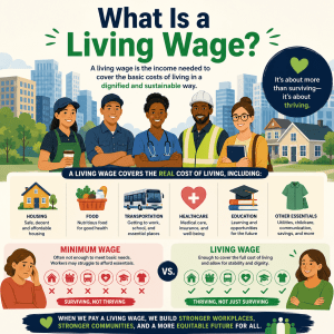
The living wage is not a single number pulled from a general inflation index. It is built from specific cost categories: housing, food, childcare (where applicable), medical, transportation, and other necessities. That specificity is what makes it such a useful policy and planning tool — and what makes understanding the drivers so important.
Not all categories inflated at the same rate. Below is an approximate illustration of how each major component contributed to the overall increase in the single-adult living wage between 2014 and 2024, based on documented cost trends across the relevant data sources MIT uses.
Bar widths represent approximate relative magnitude of increase, not absolute dollar amounts. Figures are illustrative of documented general trends; specific rates vary by county and household type.
Why the Living Wage Inflates Faster Than the CPI
One of the questions that comes up most often in conversations about wage adequacy is why workers who have received annual raises — even raises that matched the Consumer Price Index — still feel like they are falling behind. The answer lies in the composition of a household budget versus the composition of the CPI basket.
The CPI is a broad average across hundreds of goods and services, including many that households spend relatively little on: new vehicles, televisions, airline tickets, apparel. When those categories deflate or inflate modestly, they pull the overall average toward the middle. But a low-to-middle income household does not have a broad-basket budget. Their spending is heavily concentrated in shelter, food, healthcare, and transportation. If you reweight the CPI to reflect how a working household actually allocates its income, you get a number that has historically grown faster than the headline rate — particularly in periods where rent and childcare are surging.
This is not a novel observation. Researchers at the Economic Policy Institute, MIT, and the Urban Institute have documented this dynamic extensively. The living wage captures it directly because it builds the budget from the ground up rather than applying a broad index.
The federal minimum wage, unchanged since 2009, has lost significant real purchasing power over the past decade. Many states and localities have enacted their own higher minimums, but even the most aggressive of those — $17 or $18 per hour in states like California and Washington — fall short of the living wage for a single adult with a child in high-cost counties within those same states.
Housing: The Variable That Changed Everything
If there is a single story behind the living wage increase of the past decade, it is a housing story. In most U.S. counties, the housing component of the living wage — which reflects median rent for a modest unit appropriate to the household size — accounts for between 30 and 45 percent of the total. When that component rises sharply, the entire living wage figure rises with it.
How Much Did Rents Actually Rise?
From 2014 to 2024, median asking rents for one-bedroom apartments in major metro areas roughly doubled in many markets. In cities like Austin, Phoenix, Miami, and Nashville — previously regarded as relative bargains — rents in some zip codes increased by 80 to 120 percent over the decade. Even in markets with slower growth, the national median asking rent crossed $1,700 per month by 2023, compared to roughly $1,000 per month in 2014.
For households that stayed in the same rental unit and benefited from rent stabilization or simply had a stable landlord, the increase may have been less dramatic. But for anyone entering the rental market — new graduates, people who relocated, workers who moved to find employment — they encountered a market operating at the top of the historical range.
The “30 Percent Rule” Became Harder to Follow
A long-standing rule of thumb in personal finance holds that housing should consume no more than 30 percent of gross income. At a $14-per-hour living wage in 2014, a modest one-bedroom at $700/month would pass the 30 percent test. By 2024, with rents in the same market at $1,200 to $1,400 per month and the living wage at $22 per hour, the math works — but barely, and only if nothing else has gone wrong.
In high-cost markets, the 30 percent rule has effectively collapsed for workers at or near the living wage. Households in San Francisco, Los Angeles, Seattle, New York, and Boston frequently allocate 40 to 50 percent or more of income to housing, leaving little margin for any other budget category to flex. This is a structural squeeze that aggregate inflation data does not fully capture.
Single adult, no children
Living wage: ~$14.50/hr
Estimated housing budget: ~$690/month
Available 1BR rentals at or below budget: Relatively common in most mid-tier markets
Housing as % of living wage income: ~28–30%
Single adult, no children
Living wage: ~$22–24/hr
Estimated housing budget: ~$1,050–$1,150/month
Available 1BR rentals at or below budget: Limited in most mid-tier markets; tight in higher-cost markets
Housing as % of living wage income: ~30–36%
Scenarios are illustrative using representative figures consistent with documented national rent and living wage trends. Actual figures vary significantly by county. Use the calculator for your location.
Why Didn’t Supply Fix It?
A basic question: if rents doubled, why didn’t more housing get built? The short answer is that housing construction is constrained by factors that do not respond quickly to price signals — zoning rules, construction costs, permitting timelines, and financing availability. In many of the fastest-growing markets, permitting for new multifamily construction lagged behind demand growth for years. Construction costs also rose significantly during the same period, limiting the financial feasibility of new projects at lower price points. The result was a decade in which rental demand consistently outpaced supply in most high-growth markets.
Childcare and Healthcare: The Hidden Engines of Living Wage Growth
Housing dominates the headlines, but for households with children, childcare has arguably been an even more significant driver of living wage growth over the past decade. And for all household types, healthcare costs have quietly compounded year after year with little relief.
Childcare: The Cost That Can Exceed Rent
In many U.S. states, center-based childcare for an infant now costs more annually than in-state college tuition. In 2014, average annual costs for full-time infant care in a licensed center hovered around $9,000 to $11,000 in most mid-cost states and $16,000 to $20,000 in high-cost states like Massachusetts and California. By 2024, those figures had risen to $12,000 to $16,000 in mid-cost markets and $25,000 to $35,000 or more in high-cost ones.
For a single parent earning the living wage with one infant in a high-cost state, childcare alone can consume 30 to 40 percent of gross income. The living wage model accounts for this directly: when you run the numbers for a one-adult, one-child household in a high-cost county, the figure jumps dramatically compared to the childless household — precisely because the childcare component is so large.
| Household Type | Approx. Living Wage 2014 ($/hr) | Approx. Living Wage 2024 ($/hr) | Approx. Increase | Primary Driver of Gap |
|---|---|---|---|---|
| 1 adult, 0 children (mid-cost county) | $14–$16 | $22–$26 | ~55% | Housing, healthcare |
| 1 adult, 1 child (mid-cost county) | $24–$27 | $38–$45 | ~60–65% | Childcare, housing |
| 2 adults, 1 child (mid-cost county) | $16–$18 per adult | $23–$28 per adult | ~50–55% | Housing, childcare shared |
| 1 adult, 0 children (high-cost county) | $20–$24 | $32–$42 | ~65–75% | Housing dominant |
| 1 adult, 1 child (high-cost county) | $36–$44 | $58–$72 | ~60–70% | Childcare, housing |
Figures are illustrative estimates based on documented MIT Living Wage Calculator trend data and represent approximate ranges for representative household types. Exact figures vary substantially by county. Use the living wage calculator for current, county-specific numbers.
Healthcare: The Slow Burn
Healthcare costs lack the dramatic story arc of housing — there was no single “healthcare surge” equivalent to 2021–2022 rent spikes. Instead, healthcare premiums, deductibles, and out-of-pocket maximums climbed steadily and relentlessly for the entire decade. A worker with employer-sponsored insurance saw their employee premium contribution rise by an estimated 45 to 60 percent between 2014 and 2024 in many employer plans, even as plan quality remained flat or declined in some cases.
For workers without employer-sponsored coverage — a common situation in low-wage service jobs, gig work, and part-time employment — the Affordable Care Act marketplace provided options, but premium costs still rose substantially over the period. Even with subsidies, many workers earning near the living wage found that healthcare ate a growing share of their budget.
The MIT Living Wage Calculator’s healthcare component reflects estimated costs for workers without employer-sponsored insurance, which represents a conservative but realistic baseline for evaluating true wage adequacy in jobs that do not offer benefits.
Before making a decision about a job offer, relocation, or salary negotiation, run the numbers first. The Waldev MIT Living Wage Calculator shows your household’s specific requirement by county and household type — updated annually with the latest data.
How Eight Representative Cities Compare Across the Decade
National averages smooth over enormous geographic variation. A worker in rural Mississippi and a worker in San Francisco are both using the same MIT Living Wage Calculator, but the outputs differ by a factor of two or more. Looking at how individual cities have tracked over time reveals the uneven geography of this problem.
The table below illustrates approximate living wage ranges for a single adult with no children for eight representative U.S. cities. The figures reflect documented general trends from MIT data and comparable cost-of-living research over the period; always verify current figures with the calculator for your specific county.
| City / Metro | ~2014 ($/hr) | ~2019 ($/hr) | ~2022 ($/hr) | ~2024–25 ($/hr) | Approx. Total Increase |
|---|---|---|---|---|---|
| San Francisco, CA | $22–$25 | $30–$34 | $36–$40 | $40–$48 | ~80–90% |
| Seattle, WA | $18–$21 | $24–$27 | $28–$32 | $32–$38 | ~75–85% |
| Austin, TX | $14–$16 | $18–$20 | $24–$27 | $28–$33 | ~90–100% |
| Denver, CO | $14–$16 | $19–$22 | $24–$27 | $27–$32 | ~85–100% |
| Chicago, IL | $15–$17 | $18–$21 | $22–$25 | $25–$29 | ~65–75% |
| Atlanta, GA | $14–$16 | $17–$19 | $21–$24 | $24–$28 | ~70–80% |
| Indianapolis, IN | $13–$15 | $15–$17 | $18–$21 | $20–$24 | ~55–65% |
| Jackson, MS | $12–$14 | $14–$16 | $16–$19 | $18–$21 | ~45–55% |
All figures are approximate ranges illustrating documented general trends. Exact values vary by county within metro area. Use the MIT Living Wage Calculator for your specific county.
What the City Data Reveals
A few observations stand out from even this simplified table. First, the fastest percentage increases happened not in the already-expensive coastal cities but in the “newly expensive” Sun Belt metros — Austin and Denver saw living wages roughly double from 2014 to 2025 as those markets absorbed massive in-migration.
Second, even the lowest-cost markets in this sample experienced 45 to 55 percent living wage growth over the decade. A worker who has received annual 2 to 3 percent raises throughout this period has meaningfully fallen behind in real living cost terms, even in a relatively affordable market. The compounding effect of living wage growth consistently outrunning typical wage growth is the quiet story behind a decade of stagnant real wages for many households.
Third, and perhaps most concerning, the absolute gap between coastal high-cost cities and lower-cost interior markets has widened. In 2014, a worker in Austin needed to earn roughly $14 per hour while a worker in San Francisco needed $23 — a gap of about $9 per hour. By 2025, the Austin figure had reached $30 and the San Francisco figure was approaching $44 — a gap that had grown to roughly $14 per hour. Geographic wage inequality is not just a wages story; it is a living-cost geography story.
Did Actual Wages Keep Pace with the Living Wage?
The living wage going up is only half the story. The other half is what happened to actual wages paid to workers. If wages rose by the same amount or more, the trend is uncomfortable but manageable. If wages fell meaningfully behind, the decade represents a sustained erosion of household financial stability across a significant portion of the workforce.
The evidence points in an uncomfortable direction. Bureau of Labor Statistics data on median wages shows that the median hourly wage for production and nonsupervisory workers grew from approximately $20 per hour in 2014 to around $27–$28 per hour by 2024 in nominal terms — a gain of roughly 35 to 40 percent. The living wage for a single adult in an average-cost county grew by roughly 50 to 65 percent over the same period. That means even the median nonsupervisory worker — not the lowest-paid, the median — did not fully keep pace with the living wage growth rate in a typical market.
For workers in industries with historically low pay — retail, food service, home care, childcare, cleaning and building maintenance — the gap is more severe. These sectors saw meaningful nominal wage increases from tight labor markets in 2021–2022, but starting from a lower base. A worker whose wage rose from $10 to $14 per hour may have seen a 40 percent gain, but the living wage in their county may have risen from $15 to $22 per hour — a 47 percent gain on a number they were never even reaching to begin with.
🏆 Who kept up
Workers in high-demand technical fields (software, finance, healthcare professional roles) generally saw wage growth that matched or exceeded living wage inflation — particularly those in markets where their specific skills are scarce. Remote-capable workers who relocated to lower-cost markets also frequently came out ahead: their wages stayed anchored to high-cost-market rates while their living costs dropped.
⚠️ Who fell behind
Workers in service industries, retail, care work, logistics, and food production — typically the largest occupation categories in most counties — experienced the widest gaps between wage growth and living wage growth. Single parents in these fields, particularly those in high-cost urban counties, faced the most severe deterioration in income adequacy over the decade.
The Real Wage Calculation
There is a simple but instructive calculation anyone can run: take your 2014 wage (or the entry wage for a job you started around that time) and apply the growth rate of the living wage in your county over the decade. If your actual wage today is lower than that inflation-adjusted living wage floor, you have experienced real wage erosion — even if your nominal pay is higher than it was.
For a concrete illustration: someone earning $16 per hour in 2014 in Austin, where the living wage at the time was approximately $14, was technically above the threshold. If the living wage grew to $30 by 2025, that same worker would need to be earning at least $30 today to maintain the same relative position. If their actual pay today is $22 — a reasonable nominal increase — they are $8 below the threshold in a market they used to be above.
This kind of quiet erosion is one of the most important economic stories of the past decade, and it is largely invisible in conversations that focus only on nominal wages.
You can check the current living wage for your specific county and household type using the free Waldev living wage calculator. Compare it against your current income to see where you actually stand — not where the national average suggests you should be.
What This Trend Means for You, Practically
The past decade of living wage data is not just historical record-keeping. It has direct, actionable implications depending on who you are and what decisions you are trying to make.
For Workers Evaluating Their Current Situation
If you have been in the same job for several years and received regular cost-of-living raises, the trend data in this article should prompt a genuine reassessment. A 2 to 3 percent annual raise over ten years compounds to roughly 22 to 34 percent nominal wage growth. But if the living wage in your county grew by 55 to 75 percent over the same period, your purchasing power relative to your actual cost of living has declined — even as your pay stub shows higher numbers.
The practical step is to run the current living wage for your county and household type, compare it honestly to your current income, and then decide whether there is a gap that warrants action — whether that means seeking a raise, pursuing advancement, changing employers, or considering relocation.
For Workers Evaluating a Job Offer or Relocation
The trend makes clear that you cannot rely on a cost-of-living figure you calculated two or three years ago for a city you are considering moving to. Markets like Austin, Denver, Phoenix, and Atlanta have moved dramatically. Before accepting an offer in a new market, check the current living wage in that county with the MIT Living Wage Calculator and make sure the offered salary genuinely clears the threshold with meaningful headroom.
For Employers Setting Compensation Strategy
The historical trend has direct implications for wage bands and benchmarking. An employer who set their entry-level wage at $15 per hour in 2015 and applied standard 2 to 3 percent annual increases may have crossed $18 to $19 per hour by today. In many markets, the living wage has cleared $24 or more over the same period. This means an employer whose starting pay was above the living wage in 2015 may now be offering wages that fall meaningfully below the living wage in the same county — without any deliberate decision to reduce compensation adequacy.
The practical implication is that compensation benchmarking needs to include living wage comparisons on an ongoing basis, not just market rate comparisons. A pay rate that is competitive within an industry can still be inadequate in absolute terms if the whole industry has lagged the living wage trend.
For Anyone Planning Future Finances
The trajectory of the past decade does not guarantee a specific future, but it does establish a baseline expectation: the living wage will almost certainly continue to rise. Housing supply constraints, healthcare cost inflation, and childcare market dynamics are structural — they do not resolve quickly. Workers who are planning career moves, salary negotiations, or financial goals would be well served by building in an assumption that the living wage requirement will be 15 to 25 percent higher in ten years than it is today.
Designing for that trajectory — rather than assuming the current number is stable — is the financially conservative approach in an environment where the cost of living has consistently surprised to the upside.
Check your number annually, not once. Living wage figures are updated every year by MIT. A figure you looked up two years ago may be $2 to $4 per hour lower than the current estimate in a fast-moving market.
Use county-level data, not state averages. State-level living wage figures mask enormous within-state variation. A worker in suburban Cook County, Illinois faces very different costs from a worker in rural downstate Illinois, even though they are in the same state.
Account for your actual household type. The difference between a childless single adult and a single parent with one young child can be $15 to $25 per hour in required income. Make sure you are looking at the right row in the table.
Do not confuse minimum wage with living wage. Even in states with relatively high minimums, the state minimum wage and the county-level living wage are often not the same number. The trend of the past decade has widened that gap in most markets.
All the trend data in this article leads to one practical question: where does your income stand against today’s living wage? The free Waldev MIT Living Wage Calculator gives you the current figure for your county and household type instantly.
The Federal Minimum Wage in Context: A Decade of Stagnation
Any discussion of how the living wage has changed over the past ten years has to reckon with the federal minimum wage. The federal floor has been fixed at $7.25 per hour since July 2009. That is sixteen years without a federal increase at the time of writing. In the eleven years between 2014 and 2025, the federal minimum wage has not moved one cent.
Meanwhile, the living wage for a single adult in a mid-cost county has grown from approximately $14 to $15 per hour in 2014 to $22 to $26 per hour in 2025. The federal minimum wage was roughly half the living wage in 2014. Today, in most counties, it is closer to one-third.
This is not an argument about whether any particular federal minimum wage level is the right policy. It is a description of what the data shows: the gap between what the law requires employers to pay and what it actually costs to live in the United States has widened substantially and measurably over the past decade. State and local minimum wage laws have partially addressed this in some markets — but even aggressive state floors of $16 to $18 per hour fall short of the living wage in many high-cost counties within those same states.
Understanding this gap is useful for workers, employers, policymakers, and anyone who reads wage-related policy debates and wants to ground those debates in quantifiable reality rather than abstraction.
Frequently Asked Questions
Why has the living wage risen faster than general inflation?
The living wage tracks specific household cost categories — housing, childcare, healthcare, food, and transportation — rather than the broad basket of goods measured by the Consumer Price Index. Several of those categories, especially housing and childcare, have inflated far faster than the overall CPI over the past decade. A household budget that depends heavily on rent and daycare will feel far more pressure than the headline inflation number suggests, which is why the living wage has grown faster than average prices in most markets.
Has the federal minimum wage kept pace with living wage growth since 2014?
No. The federal minimum wage has remained at $7.25 per hour since 2009 and has not moved at all over the period covered in this article. Meanwhile, the living wage for a single adult in most U.S. counties has grown from roughly $14 to $16 per hour in 2014 to $20 to $26 per hour or more in 2025. The gap between the federal minimum wage and what it actually costs to live has roughly doubled or tripled depending on location.
Which cost category has increased the most in living wage calculations over the past decade?
Housing has been the single largest driver of living wage growth in most urban and suburban markets. In high-demand metro areas, median rents roughly doubled between 2014 and 2024. Childcare costs come second, with average annual costs for center-based infant care rising sharply in nearly every state. Healthcare premiums and out-of-pocket costs have also risen substantially, contributing to increased living wage requirements particularly for households without employer-sponsored coverage.
How do I find out what the living wage is in my county today?
The MIT Living Wage Calculator provides county-level living wage estimates updated annually. For a quick lookup by household type — including single adults, couples, and families with children — the free Waldev MIT Living Wage Calculator makes it easy to find your current benchmark and compare it against your actual earnings.
Have living wages increased more in cities or rural areas?
Urban and suburban areas have seen the largest absolute increases in living wages, primarily because rent growth has been concentrated in major metro markets. However, rural areas have also seen meaningful increases driven by healthcare cost inflation and, more recently, by rising food and transportation costs. The relative increase in rural areas has sometimes matched or exceeded urban areas in percentage terms even though the base number is lower.
Is the living wage likely to keep rising over the next decade?
Most housing economists and labor researchers expect living wage requirements to continue rising for the foreseeable future, though the pace will depend heavily on rent trends, childcare policy, and healthcare cost trajectories. Areas with persistent housing undersupply and growing populations are most likely to see continued sharp increases. Workers in those markets who want to stay ahead of the trend are advised to benchmark their income annually rather than relying on a number they calculated years ago.
How often is the MIT Living Wage Calculator updated?
MIT’s Living Wage Calculator is updated annually to reflect the latest data on the cost of housing, food, childcare, healthcare, transportation, and other necessities. Because costs can shift meaningfully from year to year, it is worth re-checking the calculator annually rather than relying on a figure you looked up more than twelve months ago.
The Guide Explains the Trend. The Calculator Shows Where You Stand.
A decade of living wage history is useful context — but what it ultimately points toward is a single practical question: does your income actually meet the current living wage in your county for your household type?
That question is easy to answer. The MIT Living Wage Calculator on Waldev gives you the exact current figure for any U.S. county, broken down by household type. It is free, takes about thirty seconds, and works on the most recent available MIT data.
Whether you are checking your own income, evaluating a job offer in a new city, benchmarking your team’s pay as an employer, or just trying to understand whether the paycheck-to-paycheck feeling is justified by the numbers — the calculator is the practical tool that makes this article actionable.
waldev.com/mit-living-wage-calculator/ — Select your state, county, and household type to see the current living wage. Free, no sign-up required.
Disclaimer: All wage figures and cost-of-living estimates used in this article are illustrative, based on publicly available research and documented general trends from MIT Living Wage Calculator data, Bureau of Labor Statistics publications, and related government cost-of-living sources. Figures are presented as approximate ranges to reflect regional and temporal variation. They are not representations of any single county, year, or household situation. For current, county-specific living wage estimates, always use the MIT Living Wage Calculator at the link above. This article does not constitute financial, legal, or employment advice.